")
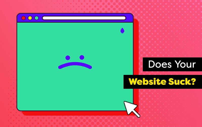
In today’s digital era, having a well-designed and functional website is crucial for any business or individual looking to establish an online presence. A poorly performing website can not only deter potential customers but also hinder your brand’s credibility. So, how can you tell if your website is falling short? In this article, we’ll walk you through the key indicators and steps to diagnose if your website sucks and provide actionable solutions to improve it.
Lack of Engaging Website Content
Content is king, and a website without valuable, up-to-date, and engaging content can fall flat.
Evaluate your website’s content to determine if it provides value to your target audience.
- Are the text and images outdated?
- Are there grammatical errors or broken links?
- Is the content compelling and persuasive?
Update your website with fresh, relevant content, including:
- Blog posts
- Videos
- Case studies
- Testimonials
- Use eye-catching visuals
- Optimize your content for search engines (SEO)
- Provide clear calls-to-action to enhance engagement
“This sounds like a lot of work.” – You
“We can help.” – Us
If you’re stuck, contact us today, and we’ll give you 5 free, personalized ideas for content you can create today. Still too much? Let us do it for you. We’re experts at creating great content.
High Bounce Rates and Low Website Conversions
High bounce rates (when visitors leave your site after viewing only one page) and low conversion rates are indicative of a problematic website. Monitor these metrics using analytics tools like Google Analytics.
Here’s the a tip to improve your engagement and performance quickly:
Analyze the pages with the
highest bounce rates and low conversion rates
to identify potential issues.
It could be related to slow loading times, unattractive landing pages, irrelevant or weak content, or a cumbersome checkout process. Improve your website’s conversion potential by streamlining your user flow, optimizing landing pages, adding persuasive elements, and simplifying your checkout process.
Slow Website Loading Times
One of the most common signs of a subpar website is slow loading times. If your website takes ages to load, visitors are likely to lose patience and leave, resulting in lost opportunities. To diagnose this issue, use online tools like Google PageSpeed Insights to test your website’s loading speed.
The most common factors for slow website loading times we’ve found are:
- Large image sizes
- Lack of caching
- Excessive plugins
Optimize your website’s performance by compressing images, minimizing HTTP requests, and implementing caching techniques.
Poor Mobile Responsiveness
With the increasing use of smartphones and tablets, having a mobile-friendly website is non-negotiable. If your website looks distorted, unorganized, or difficult to navigate on mobile devices, it’s a clear sign of a problem.
- Check your website’s responsiveness across various screen sizes using tools like Google’s Mobile-Friendly Test
- Consider adopting a responsive design that automatically adjusts to different screen sizes
- Optimize your images for mobile
- Ensure that touch elements are appropriately sized and spaced
Outdated Web Design
Website design trends evolve rapidly, and an outdated appearance can make your website appear unprofessional or irrelevant. Compare your website to industry-leading websites to see if it measures up.
- Look for signs of outdated design elements, such as:
- Flashy animations
- Cluttered layouts
- Mismatched color schemes.
Updating your website’s design can involve:
- Simplifying the layout
- Choosing a modern color palette
- Incorporating whitespace
- Using consistent typography
Ineffective Website Navigation
A website with confusing or illogical navigation can leave visitors frustrated and unsure of how to find the information they need.
Assess your website’s navigation by considering the following questions:
- Are the menu labels clear and descriptive?
- Is there a search bar for easy access to specific content?
- Can visitors find essential pages within a few clicks?
Mystery Meat Navigation Stinks
Do visitors have to hover over an image to see what a link is? We call this ‘mystery meat’ navigation, and it is every bit as unappetizing as that stuff you had in the school cafeteria.
Do visitors have to hover over an image to see what a link is? We call this ‘mystery meat’ navigation, and it is every bit as unappetizing as that stuff you had in the school cafeteria.
We’ve found that visitors usually click on the first link or two that smell like what they are looking for. Label your links so that visitors get a good strong whiff of what they’ll get when they click. It’s the ‘mystery’ part of the mystery meat that really stinks.
Conduct user testing or seek feedback from others to identify pain points and improve navigation. Implement a logical menu structure, use breadcrumb navigation, and ensure that your site’s search functionality works seamlessly.
Need help conducting user testing or making your navigation more appetizing? We’d love to help. Contact Us to Get Started
OK, Your Website Sucks. So How Do You Un-Suck Your Sucky Website?
Your website is a powerful tool for attracting and engaging visitors, and it’s vital to regularly evaluate its performance to ensure it meets the expectations of your audience. By diagnosing the signs that indicate your website may be falling short, you can take proactive steps to improve its functionality, design, and overall user experience. It is important to diagnose and fix the specific problems that are making your website suck, so that you can address them by priority rather than spending too much time fixing problems that don’t make a big difference.
You’ve read this article, so here’s your next step:
Read Knoodle’s Guide to Fixing Websites that Suck
We wanted to call this guide ‘The Website Un-Suckinator’, but then we imagined you trying to get buy-in from your team by bringing copies of ‘The Website Un‑Suckinator’ to your next meeting.
Your Website Sucks. We’d Love to Help.
Remember, diagnosing if your website sucks is the first step towards making meaningful improvements. You’re not alone in this journey. Millions of websites suffer from suckiness every year.
If you’ve read this far and identified signs that your website sucks, don’t fret. Knoodle is here to help you revitalize your online presence and maximize the potential of your website. We don’t think any business should have a sucky website, especially not yours.
With our expertise in content creation, web design, optimization, and user experience, we can address the issues hindering your website’s success.
We can help you diagnose which specific parts of your website suck, and more importantly, how to un-suck your website.
Here’s your Call to Action
Let us partner with you to create a compelling, user-friendly website that captivates your audience, boosts conversions, and establishes your brand as a leader in your industry.
Contact us today to take the first step towards a website that doesn’t suck, and drives meaningful results for your business.
P.S. – Your first consultation is free, and we guarantee that you’ll come away with a much better understanding of what is making your website suck and how we can help you fix it.
Still not ready to put a ring on it? That’s OK. Read Knoodle’s Guide to Fixing Websites That Suck. Share it with the folks that still need some convincing, and we’ll be here when you are ready.